
Branding has been unveiled for San Diego Loyal SC, a USL Championship expansion club that will begin play in 2020.
The 2020 expansion side unveiled its crest design and colors at a community event in downtown San Diego on Saturday morning as it continues its preparations for kickoff in March 2020 at Torero Stadium on the campus of University of San Diego.
“San Diegans are incredibly loyal to their soil; we wanted to declare the same and what better way to do it than by calling our club San Diego Loyal,” said Chairman and San Diego native Andrew Vassiliadis. “We know through thousands of conversations with the community that we are all here by choice. This is a place we choose to live, because of our shared passion for the region’s beauty and outdoors, and the diverse and independent spirit of its locals.”
Inspiration for the club’s name, crest and colors were discovered and designed from listening sessions, surveys and one-on-one chats around what residents and fans love about San Diego and want from their soccer club. During those conversations, multiple themes emerged including the importance of a diverse community, the passion shared for the coastal lifestyle, the vibrant colors in the region’s sunrises and sunsets and the independent spirit embodied in the people.
“The greatest soccer crests in the world are iconic to the place and people they represent and built by the community,” said President and Co-Founder Warren Smith. “San Diego Loyal is no different. The crest that our players and fans will wear over their hearts is one that will be here to stay. For now. For always. For San Diego.”
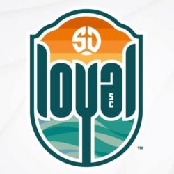
The crest includes multiple symbols that celebrate both San Diego and the world’s game. It includes representation from San Diego’s sky, land and ocean. The sky is represented by an “SD” Mark that resembles both the sun and a soccer ball. The “SD” Mark is set against vibrant orange hues, iconic to the region’s sunrises and sunsets. The four bands of color also represent the club’s four pillars – independent, authentic, inclusive and optimistic. Land is represented in the word “loyal” and is positioned in between the sky and ocean. “Loyal” is set in the color of Torrey Green in honor of San Diego’s Torrey pine – a tree indigenous only to the region – and will be a color unique in the North American soccer landscape.
The interwoven colors in the ocean imagery, located at the foundation of “loyal,” is symbolic of the comfortable diversity in San Diego’s communities. Lastly, the “Y” in loyal is connected to the bottom of the crest to symbolize an anchor and the club’s commitment to stay, as well as, a California poppy to pay homage to the state. All of these elements are encompassed in a shield that draws inspiration from the Spanish architecture of San Diego’s past, and the elegant curve of the Coronado Bridge.
The team’s crest was designed in collaboration with local and award-winning agency Red Door Interactive, with design led internally by Creative Director Patrick Cinco.
RELATED STORIES: Andrew Vassiliadis Unveiled as USL San Diego Chairman; USL San Diego Set to Announce 2020 Launch; USL San Diego Announces Front Office Hirings; San Diego USL Club Unveiled, But Work Remains; Landon Donovan, Warren Smith to Back San Diego USL Club