 Today sees one of the biggest changes ever in MLS branding, as a new initiative was unveiled by league officials this morning — complete with team-specific crest colors.
Most noteworthy: gone is any literal reference to soccer, per the old logo and its previous permutations. This was a conscious decision by the MLS branding crew: to prevent a dated look (and indeed, the old logo does look dated), the decision was made to go with a more classic timeless design. Instead, we have an actual crest — more in line with worldwide soccer tradition — and just a three-letter branding: MLS. Per MLS, here’s what the new crest means:
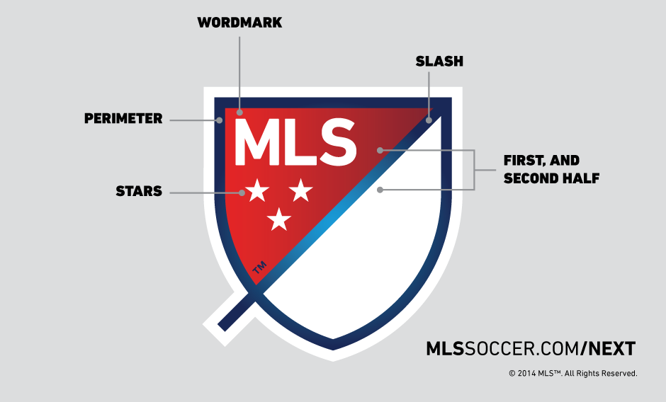
WORDMARK: MLS stands for Major League Soccer.
SLASH: The slash refers to soccer’s speed and energy. The slash begins outside the perimeter and drives upward at a 45-degree angle to illustrate both the nonstop nature of our game and the rising trajectory of our league. It bisects the crest to create a “first half” and “second half.”
STARS: The three stars represent the pillars of our brand: For Club, For Country, For Community.
PERIMETER: The perimeter represents the lines that mark off the field of play.
FIRST HALF AND SECOND HALF: The first half contains MLS and the three stars. The second half is an open white space that brings you in and out of the MLS world.
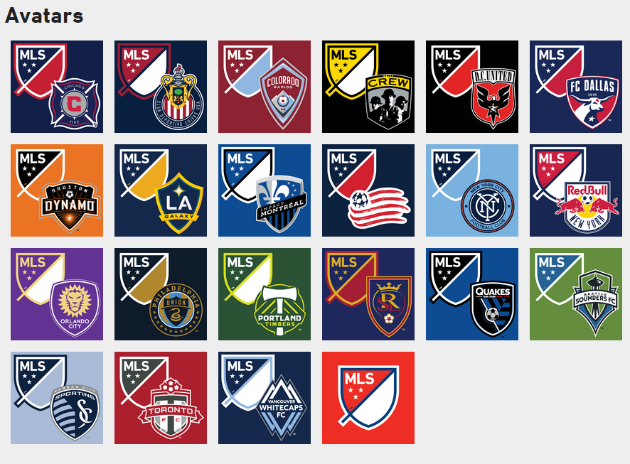
Another utterly fascinating twist: the league also unveiled team-specific versions of the new crest, coordinating colors with each team:
The new branding, by the way, was overseen in-house in conjunction with the Gigunda, Athletics and Berliner Benson agencies.
Image courtesy Major League Soccer.


